Rick's b.log - 2015/11/09
You are 18.224.0.25, pleased to meet you!
Rick's b.log - 2015/11/09 |
|
| It is the 29th of April 2024 You are 18.224.0.25, pleased to meet you! |
|
mailto: blog -at- heyrick -dot- eu
DO NOT USE SPRITES IN YOUR DOCUMENTS!
I cannot stress that enough.
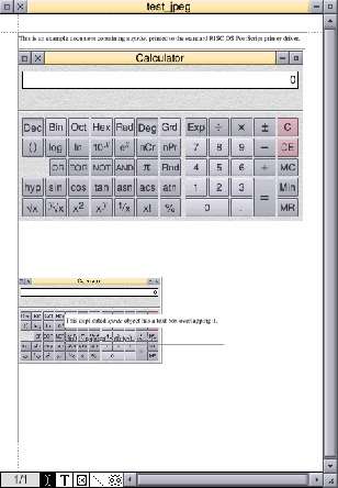
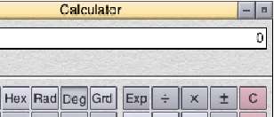
Look, here, consider this example file. The image is a picture of the SciCalc window.
I cannot offer you a copy of the PDF that was generated when the picture was a sprite file. This is because the PostScript driver spat out this monstrosity...
What went wrong? It's simple. The Acorn era PostScript driver is somewhat crap and will render sprites by generating an appropriately sized square object for each pixel of the image.
What can be done?
There are two options. The commercial option is Martin Würthner's PostScript 3 driver (£35 / €40) which is greatly enhanced over Acorn's older drivers.
The non-commercial (free) option is to use JPEGs. JPEG images are passed to the PostScript file as JPEGs, and are converted to PDF more or less intact. Rendering speed is retained, a JPEG is a JPEG...
But, wait, aren't JPEGs lossy?
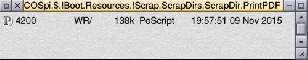
Don't take my word for it - here's the above document as a PDF: print_jpeg.pdf (113KiB). The window content used in this document was grabbed with Snapper exporting as JPEG, with JPEG quality set to 95%.
And it looks rubbish?
This is easily fixable.
Go to PrintPDF's Choices... (iconbar menu) and select the Optimisation "
In the window that appears, ensure the image compression is Flate (and not JPEG). Do it for all three types. Also, make sure the image downsampling is not active.
Now, documents will be printed with the images not compressed to hell and back, like this:
Note: You could also choose to untick all of the Image compression options; however this appears to make a file twice the size (using the test document) with no noticeable difference in output...
Consider this document:
Now, the big poppy drawing is a DrawFile that I knocked up. This process requires DrawFiles and not bitmaps because you will need to have transparency. You might have some joy with MW's PostScript 3 driver and sprites with masks, but this isn't something I can try (as I don't have the driver...). Leave a comment below if you do and it works.
Anyway. Here's the cheat close-up with the image hidden:
What I did was to create a picture frame (for the poppy) from the main text frame. This becomes the top-most frame and could straddle both columns.
How it was made:
Printing with Ovation - don't use sprites
Don't use sprites!
Chances are, these days, you will be wanting to "print" documents as PDF files.
 ...and either PrintPDF or (more likely) the GhostScript back-end choked on it so badly that the machine froze.
I really wish I was messing with you.
But I'm not.
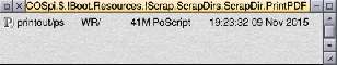
The picture is 400×239 and it appears twice. That means there may be approximately 191,200 (no, that's not a typo - a shade under two hundred thousand) squares in the PostScript file. This explains the huge PostScript file, and probably why GhostScript pooed itself.
Probably just as well. Can you imagine sitting there while Adobe Reader on a tablet redraws all that rubbish?
Yes, they are. However these effects are mostly invisible if you set the quality in your originating program to be 95%-98%. Keep the quality high. Of course, it would be better to be able to use a proper original bitmap, but not when this means hundreds of thousands of tiny fragments...
Oh noes!!1!11! It's all gone horribly wrong!!1!ONE!
Let's see. You are using the Acorn PostScript driver. You are using PrintPDF with GhostScript. You are using JPEGs.
Custom...".
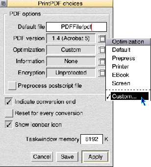 Click on
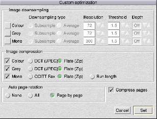
Set and then on Save in the main choices window.
Creating runaround text
Runaround text is text that flows around an irregular-shaped object. It "adds impact", for square frames are so eighties. An irregular flow is a fairly simple thing to create in OvationPro, but may also be created with Ovation using some lateral thought.
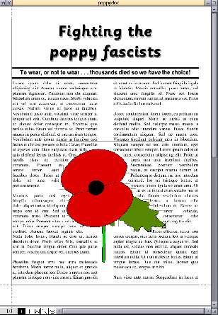
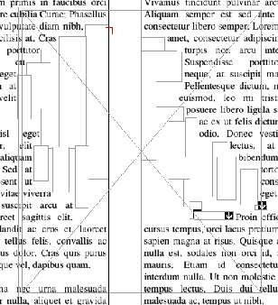
I placed the poppy drawing inside the frame, and then set the frame to be transparent.
This caused all of the text to reflow back as if the frame wasn't there.
So I then created small text frames within the text column. This is important - as these new frames become "children" of the text column frame and lie underneath the poppy frame. The little text frames, and there are numerous, were sized and dragged into place to 'repel' the text. Careful placing allows the text to be repelled on a profile that more or less matches the poppy. Obviously I spent about ten minutes on this to show you the idea. A bit longer would lead to even more pleasing results.
The result isn't bad - poppydoc.pdf (13KiB) - there are a few things that could be tidied up (left: comma after "nibh" at top; "at" at bottom; right: "turpis" line to "Pellentesque" line should be indented differently; ditto for "tortor" line to "eget" line), but it serves to illustrate the point.
Going beyond
Here is the front cover of a fictional magazine:
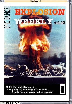
The resultant PDF doesn't look bad, although the PDF file size is six times the size of the original (huh?). Anyway, take a look for yourself: explo42.pdf (1.3MiB).
David Pilling, 11th November 2015, 22:05
Yes it is a mess, which is why Martin W did the level 3 driver.
| © 2015 Rick Murray |
This web page is licenced for your personal, private, non-commercial use only. No automated processing by advertising systems is permitted. RIPA notice: No consent is given for interception of page transmission. |