It is the 1512th of March 2020 (aka the 20th of April 2024)
You are 3.22.181.209,
pleased to meet you!
mailto:blog-at-heyrick-dot-eu
iOS 7
I held off writing about the all-new iOS 7 because I wanted to get to see it in action rather than write about my initial thoughts. Then a hellish work schedule intervened and...it's a few weeks later. This isn't a bad thing, it has given me lots of time to get to know iOS7.
Installing iOS 7
The upgrade to iOS 7 was something in the order of 750MiB (and it claimed to need a couple of gigabytes of free space in which to unpack itself). This was estimated to be a download of some four hours. I think mine took about three. I have noticed when looking at the App Store and installing apps, that Apple's servers are noticeably slower than Google's. To then roll out a major update to everybody and everything, it isn't really a surprise that everything slowed down.
Once the download had been completed, it took another forty odd minutes for the software to unpack itself, more time to "verify", about twenty five minutes to upgrade, and a further ten or so to do some setting up.
Here are some random comments about the installation process:
Once you click to upgrade, there is no option to "cancel". When I saw how long it was going to take, I would have preferred to abort and do it during the day. I started at 9pm, and everything was done for half one in the morning. I tried a restart, a power down, all sorts. But no, the upgrade just kept on going.
...of course, this is when you have the option to upgrade. I didn't install iOS 7.0.2 and I was rewarded with the iPad downloading the iOS 7.0.3 update for me without asking. Apple - that sort of thing is shitty, please stop it.
During the hours before and the days after, the App Store information on apps to upgrade went crazy. I have about 12 apps to upgrade. Then I had something like 47 (what is that, all of them?). Then they were all up to date. Now, I am back to the 12 I will update when I get around to it, if I decide to upgrade. No, I don't allow automatic actions, thank you.
Very sneaky, putting in changes of licence terms on the back of the updates. No, I did not read the new Ts&Cs. Why don't you try to be like Amazon and tell us what has changed? I do not see how Joe Average is supposed to read, understand, or even have the inclination to wade through forty pages of rubbish that I bet is written in pseudo legalese, with pages of disclaimers WRITTEN IN BLOCK CAPITALS, THUS FURTHER DECREASING LEGIBILITY.
Furthermore, are these terms even contractually tenable? There was no warning of a change of terms prior to update, and the option is therefore to accept or cease using your product. You might find in some jurisdictions that we can only be held to what we agreed to initially. Of course, this might be hot air as the changes were minor. It just seems lazy to not point out what has changed.
That's not all. It looks like everything that has a licence (iCloud, iTunes Store, iOS itself) wants you to agree to the licence. Pages and pages of it. Do you really think we're going to read this every single time?
Welcome to iOS 7
The trendy cafè latte drinking hipster crowd's new favourite word is skeuomorphism. Basically this means "visual cruft". Looking at the keyboard (for some reason, QuickOffice that I am using comes with the older keyboard style - which is a very good thing) I can see the keys look sort of 3D. The keyboard background fades from a mid grey to a darker grey. It looks okay, and it doesn't glare in your face.
The lovely new look cruft-free keyboard is flat. Solid colours. The key backgrounds are solid. In the case of the usual keyboard style, solid white. It is bloody awful. I have said that I tend to run my iPad Mini at about 40-50% brightness because the screen at 100% is incredibly bright. Ease of use is really not enhanced by having a bright keyboard glaring at you.
It is inconsistent as well. The quick search keyboard is a more pleasing grey on black. It would be nice to have an option to select that as the keyboard, if the older style is going to be deprecated as being "crufty".
There used to be a sort of quilt-effect backdrop behind things. Drag a web page beyond its size, you'd see a little bit of this. It was utter visual fluff, but it was a nice touch of style. Now? Now it is solid grey. That is so pedestrian it is hard to believe that this is an Apple product.
Not only that, but those buttons have gone. In fact I think most of the buttons have gone, to be replaced by plain blue text and drawings that are bland blue icons that look like something a five year old could have drawn.
Perhaps the biggest gripe with the so-called "beautiful new design" is that it looks like the bastard love child of Windows v1 and GEM. Seriously, we have time travelled to the early '90s. I must hand it to Apple for their astonishing ability to take a piece of coolness and turn it in something that looks like a DIY GUI cobbled together for a hand-me-down Amiga.
I can live with the blue icons. But this rampant flatness, this removal of visual clues to indicate where buttons are, instead relying upon you to spot blue text. It looks as if this flatter-than-flat trend that companies are embracing is to become The Hot New Thing. I guess all the tech guys calling the shots these days are too young to recall that we spent a decade getting away from this sort of layout. Okay, granted, Microsoft's Aero was way over the top - but, for God's sake, even RISC OS has more clarity and definition in its user elements than iOS 7!
Here, look at the iOS 6 sign-in prompt:
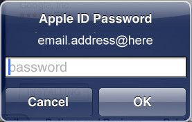
Now compare this with the iOS 7 version:
Perhaps sensing the tide of dissent, TheRegister reports that Apple has nobbled iOS 6 availability, so if you have upgraded, you are stuck with the new-look system; you will like it, period. God forbid Apple do something as original as provide "skins" so users can choose how they'd like their system to look.
Various parts of iOS have been styled using thinner and thinner components. The pop up selection choices are now bordering on being difficult to read. There is a "make some stuff bolder" option, but it doesn't return things to how they used to look. I guess it looks nicer on a Retina display, but even so there's no reason to encourage eye strain, surely? The actions to perform on selected text is harder to read than it was in iOS 6:
At least the stylish watercolour-translucent effects are kicking around in the lock screen notifications and the control panel; unless you have the "Accessibility -> Increase Contrast" configuration option switched on, which appears to just disable this effect.
Lock screen
Given the hoo-ha over the patent for the "slide to unlock", it is interesting to note that Apple have discarded the drag-to-unlock button and instead made the text on the whole lock screen move out of the way. You can also access notifications and the control panel from the lock screen, if you have configured it so.
This is the lock screen:
And this is the lock screen with notifications:
I should point out that there are a dozen images available for use as the lock screen or system backdrop, and they are good. Alternatively, you can use one of your own pictures.
Passcode
New to iOS 7 is the ability to set a pass code, plus the option to erase all data held on the device if the pass code is entered incorrectly ten times. I'm not so sure about the last part, it might have been better to lock down the iPad until it was connected to the previously paired iTunes, because there is now a temptation for miscreants to sneakily try entering a bunch of incorrect pass codes into the iPads of those they don't like. Still, I guess better late than never to have something to protect your iThingy from being wide open. Of course, it took two firmware updates before this actually worked. :-P
Task switcher
Also new to iOS 7 is the fancy task switcher. This shows you a little screenshot of each task, flick up to terminate the task. This looks quite stylish, and the screenshots are a nice touch. It is an interesting bit of visual fluff in comparison to the amounts being removed.
Notifications
The Notifications view could have been expanded, to handle various application notifications in a style closer to Android. The contrast being that Android notifies you of everything, while iOS is much more restrained. While the previous notification panel was a pull down panel, the new one is pull down but it takes the entire screen. Weather still won't work due to extreme Location Services brokenness, there is no Stocks report (that seems to be an iPhone thing), the view is split into three sections. Frankly, it is a mess. Not only does iOS eschew widgets, it goes further and makes the notification use sections so what you need to know is not right in front of your face.
Want to know what is happening in your diary? Or the weather (if your Location Services actually works)? That's in the "Today" tab. Or maybe swipe to the right? At any rate, it isn't here.
Control Panel
New to iOS 7 is the Control Panel. This is a nifty pull-up panel which allows a greater control of the device. You used to be able to control music, brightness, and sound by double-tapping the Home key then swiping to the right lots to reveal extra controls.
The Control Panel takes this a stage further to permit not only that, but direct control over Airplane Mode, WiFi, Bluetooth, Do Not Disturb, display rotation lock, as well as quick access to the timer and the camera. In other words, Apple finally noticed one of the benefits of having home screen widgets on Android (I can do this stuff right on my Home Screen on my mobile). It is very welcome, as the alternative is to dick around in Settings.
Home screen
The home screen has barely changed. New/updated apps are signified by a tiny pale blue dot (VLC in the picture below) - Carl Sagan, are you watching? The calendar app shows the date, and the clock app shows the current time. Some other apps might have a number superimposed to permit you to know how many outstanding events there are (App Store and Mail in the picture below). That is as close to "widgets" as Apple gets. While they are taking a definite stance against the sort of clutter usual on other platforms, there can be something said for a more restrained use of widgets. I have on my phone a weather widget, plus phone status (signal strength, storage space, etc), plus a larger clearer clock that also displays the date and if there is an alarm. It seems odd that Apple wants to aim for a more serious work-friendly device than the average cheapo Android tablet, yet makes it more difficult to look at all the information you never needed to know.
Here is my main iOS home screen:
For comparison, here's my Android one - notice how much extra information is right there, even though the system is set up for a screen a quarter of the size of the iPad Mini:
Browser
The browser has received a make-over. Things that used to be in a favourites tab are now icons that appear when you are entering URLs. This makes it easy to select your favourites, and they are represented by an icon if the site provides a large Mac-friendly icon. I ought to do this for my site...
Unfortunately, perhaps in response to the lowing amount of memory on board these sorts of devices, the browser now refreshes pages frequently. It isn't quite as psychopathic as my Xperia U that seems to throw away everything if you so much as look at an SMS while browsing, but it could start to get annoying, and I have lost forum posts because the stupid browser decided I was looking at a different web page for 'x' seconds, so it'd throw away the content of the one I'm not currently looking at.
The bug still remains that if you open a link with a #position in the URL in a new tab, the page is opened at the top. The positional reference is not followed, nor respected, unless you tap on refresh while the page is in the foreground. Lame, Apple...
Oh, and going to translate.google.com will crash the browser.
Email
Email - looks pretty much like email, only with less attractive styling. A small bug exists here, in that the "On <blah blah>, <so and so> said:" text, for some reason, is quoted. Additionally, the signature text is inserted at the top of the message. Given you can insert in-reply text, which is a brilliant option (take that Android!), it would be nice to have an option of whether to place the signature at the top, or at the bottom.
There are some nice touches, selecting multiple emails will show them stacked, and as I said the ability to quote in-line makes the iOS mail client streets ahead of anything else supplied as standard.
Siri
Siri doesn't seem to have changed much, functionally speaking. Still a bloke. Now takes up the whole screen instead of a pop-out panel, and there's a sort of wibbly line thing when you speak. For a while, Siri sounded dreadful, but this seems to have been fixed in 7.0.3. No option to change voices yet...
Music
Nothing much to report. An already plain looking app is even plainer looking. Still can't deal with ShoutCast style webradio - Apple is launching its own radio, but not outside of America yet, it seems. Some people have commented on the nifty little VU bars beside the currently playing song.
It's a lie. Load up any music with loud bits and quiet bits and you'll notice the VU bars absolutely do not respond to the music. Rather, I think the bars update to a randomly chosen interval for each bar, chosen when playback of a song begins; and as such it is a visual effect and nothing more. Shame, a real visualisation would be kind of cool.
Calendar
The calendar is something I am making more use of. I noticed that it supports syncing with iCal, so I have set it up to show me French public holidays, Japanese holidays (in romaji!), sunrise and sunset, moon phases, and seasons. It would be nice if the calendars had a "silent event" option, so things like sunrise could be shown without being notified of this as a scheduled event; though I suspect this might require a change in iCal rather than the iOS calendar.
Jotter/notes
The jotter/notes app has ditched the cute handwritten style text and the paper-like background, to look... again, boring. Functionally it is no different, suffice to say that now there there is nothing to distinguish it. There is no "style".
Mom says...
In response to my first review of the iPad - Mom wants me to point out that the iPad is "mom-friendly" and that it is fairly easy to use. I told her to demonstrate by taking a photo of the cat (any one would suffice) and email it to me.
Umm...
Actually, she can find her way between iBooks and Kindle and knows how to get to and fro between them and the home screen icons. Maybe one day, because yes, the iPad is fairly easy to use. But not that much that soon. ;-)
Yes, mom reads my b.log. Well, the bits she understands, at least...
Final thoughts
A lot of things may have changed in iOS 7, the parts we can see have changed less. There is no radical new thing to drool over. Multitasking is still lacklustre bordering on broken[1], Bluetooth still can't talk to the real world[2], Location Services is still useless[3], and the entire operating system has had an amateur hour makeover designed by a five year old that doesn't like any colour other than blue...
So, if I had to pick a single word to describe this update, I would pick "disappointing". The old school styling doesn't do Apple any favours, plus the additions, while welcome, aren't jaw dropping. To be honest, I could just as happily revert back to iOS 6. And I suspect I am not alone, which is why Apple has gotten rid of the iOS 6 firmware - we do not get to downgrade, we are stuck with iOS 7. Oh well, I guess we can hope for future updates that might put some of the old niceties back in?...
#1 - It would be nice to have a download run in the background and not have to have the app active and the iPad's display illuminated. Some apps are capable of background operation (iBooks, for example), so why is this not available to others?
#2 - Apple has introduced something called AirDrop for shuffling things between iOS devices. It still shuns the PIM File Transfer / Object Push methods used by everybody else. So I still email photos to my phone to bluetooth them to the computer. Wake up Apple, it's 2013.
#3 - Screenshot of part of a "chat" with Apple Support (I'm blue):
Well? It's been a month. I'm still waiting...
Still...
I use my iPad for watching animé...
and:
Even though the image is letterboxed as the screen is 4:3, the quality of the screen makes it lovely for use for watching animé!
I use it for web, forums, email, writing stuff, etc as well. It is a convenient size. This b.log entry was marked up and finished on the eeePC, but the body was written on the iPad...when I wasn't falling asleep or distracted with other things.
To be honest, the look and feel of iOS 7 is not such a big deal. I'd probably think it was okay if I hadn't previously seen iOS 6. It works in much the same way, there's been no great change there. It just... you know, for all the things people say about Apple, this doesn't exude style like you would expect. Apple made a statement, a very big statement, with the blue and white iMac all those years ago; so we've come to expect Apple stuff to look good. Somehow, iOS 7 just doesn't seem.... cool enough. You can have understated cool, but one might suggest the iOS 7 UI has wandered so far down Minimalist Avenue that it got lost somewhere in a maze of twisty little passages, all alike.
Your comments:
Please note that while I check this page every so often, I am not able to control what users write; therefore I disclaim all liability for unpleasant and/or infringing and/or defamatory material. Undesired content will be removed as soon as it is noticed. By leaving a comment, you agree not to post material that is illegal or in bad taste, and you should be aware that the time and your IP address are both recorded, should it be necessary to find out who you are. Oh, and don't bother trying to inline HTML. I'm not that stupid! ☺ ADDING COMMENTS DOES NOT WORK IF READING TRANSLATED VERSIONS.
You can now follow comment additions with the comment RSS feed. This is distinct from the b.log RSS feed, so you can subscribe to one or both as you wish.
This web page is licenced for your personal, private, non-commercial use only. No automated processing by advertising systems is permitted.
RIPA notice: No consent is given for interception of page transmission.